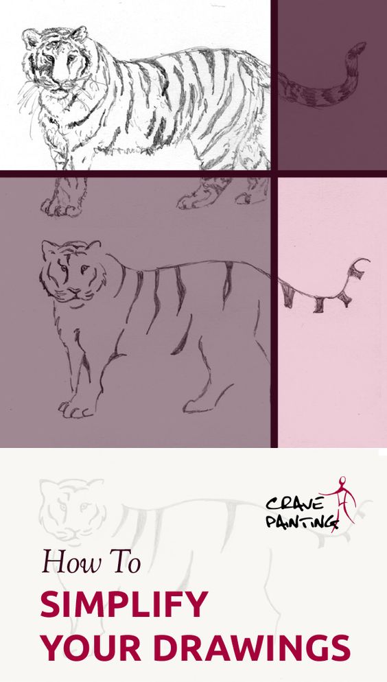
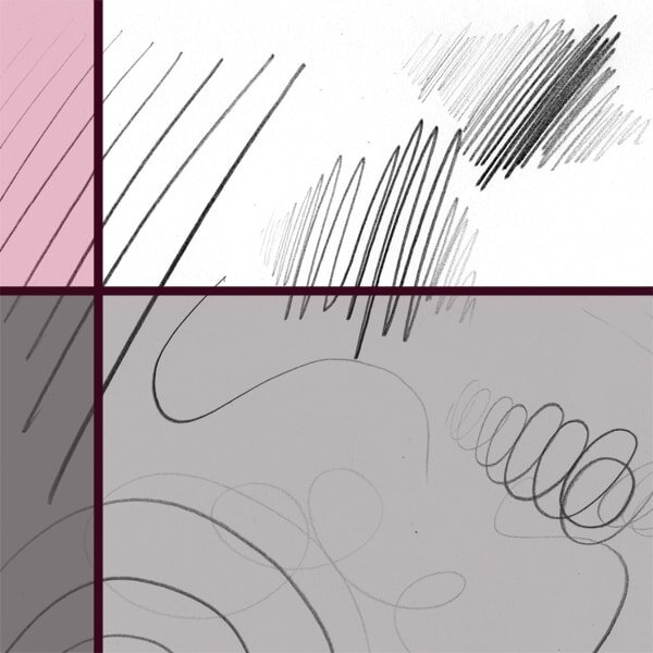
How to Simplify your Drawings
Knowing what to include and what can be left out without compromising the work is a skill vital to any artistic direction that isn't photorealism, especially in sketching.
You'll want to be able to portray your subject and deliver the message to the widest possible audience, without including every single little detail.
In order to do that, you have to figure out what the essence is of what you are portraying, whether that's a person, an object, or a feeling.
What does simplification mean?
The dictionary defines it as "the process of making something less complicated and therefore easier to do or understand". In art "less complicated" often means less realistic. So, logically, a simplified drawing is everything that isn't photorealism.
Technically, a simplified drawing is everything that isn't photorealism.
The moment you leave something out that you see, be it a line, or a surface structure, you've simplified the subject. But there are certainly varying degrees. Technically, if you don't draw every single leaf on that tree, or every single hair on that model's head you're simplifying.
For the purpose of this article and exercise we're going into a more obvious direction.
Simplification all around us
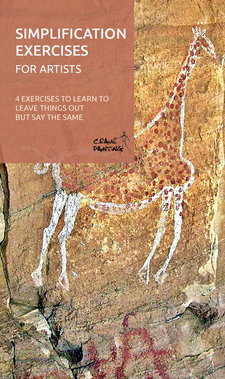
The first ever simplifications (that we know of) were cave paintings. Probably less as an artistic statement and more because of restrictions in drawing material and technique development.
I guess it's not easy to paint a photorealistic, prehistoric gazelle onto a rough stone wall with a paste of crushed rock and animal fat on a stick.
Not that it was needed. If you look at the below examples you will find that with only a few lines and a restricted colour palette it's pretty obvious what the paintings depict, even now, thousands of years later.


An area where it's particularly important to convey a message quickly and plainly is warnings and informational signage. Looking at the below, it's (hopefully) clear to all of us what the message of these signs is.
And that's done with literally just a few geometrical forms and two to three colours. In fact, this form of simplification is so fascinating that it's a study in its own right, called semiotics.


Letters, numbers and mathematic symbols are also great examples, especially since they portray concepts, rather than physical objects. There's no such thing as a + in nature, and yet everyone, at least in our civilisation, knows what the symbol represents and what to do with it.
Simplification is all around us. On the streets, on household appliances, on the app symbols on our mobile phones.
Simplification and target audience
Someone that grew up, say, in the Amazon rain forest without a TV or any other link to the wider world is unlikely to grasp the concept of a wheelchair from just a half-circle, as in the example above. Because they've likely never seen one. In that case the simplification is too simple to convey the message.
You’ll need considerably less detail to draw Onigiri for someone from Japan to recognise. If it’s a common part of your cuisine, it’s easy to “fill in the planks” when confronted with the below icon of basically a rounded triangle and a square.
For a European you’d have to likely use more detail, draw some rice pattern, or at least put the icon in context, such as within other (more easily recognisable) icons of Japanese foods.

When simplifying anything, a sign, a drawing or a concept, it’s always a good thing to consider the target audience and their prior level of knowledge. Different people need varying degrees of information to arrive at the same conclusion, because they start the ‘journey’ at different points.
With any kind of simplification you’ll need to consider the prior knowledge of your target audience.
These differences can be in culture, upbringing, gender, interests or even from person to person. You’ll need less time and fewer words to explain quantum mechanics to a physics major than someone with no scientific background. Just as it’s easier to understand the meaning of the symbol of a triangle, a circle and a line for a Harry Potter fan.
Of course, at a certain point of simplification a subject will be hard to figure out for anyone other than the artist himself. Not that it’s always necessary to know what an image depicts in order to appreciate it, as abstract art shows so well. Have a look at this sketch from Dutch artist Fons Heijnsbroek.
Fons Heijnsbroek sketch of a wide Dutch beach, 1990
Most of us will immediately be able to tell that it’s a landscape. But what kind? It’ll hugely depend on where you live.
I saw a meadow in it, with some houses in the background and hill in the distance. Because that’s the kind of countryside I am used to, so that’s what my mind filled into the blanks. But you could just as well see a rocky surface, a desert or snow.
Children’s natural ability to simplify
Children are masters at simplifying things. Sometimes more, sometimes less successfully. A yellow triangle in the corner is universally understood as showing the sun and a circle with a couple of straight lines can convey the meaning of ‘human’ to pretty much anyone who looks at it.

Unfortunately, what children do naturally many adults have trouble with. We often feel like our pieces have to look realistic, in order for them to be considered ‘good work’.
I'm sure most of us have thought, at some point or another when looking at a piece of art: "this looks like it was done by a 6-year-old" (I know I’m guilty of that with several Henri Matisse paintings).
But perhaps it's time to ask ourselves why that is seen as an insult, when children seem to be so good at conveying their message with the least amount of effort and the limited artistic skill they have.
Indeed, some of the most thought after drawings in fact combine the best of both worlds, by using the training and experience of a professional artist but always searching for that natural ability to simplify, as children have it.
How do you simplify in the arts?
Despite of the amount of simplification around us, it can be surprisingly difficult to successfully achieve in your own art. In order to simplify your drawings you're going to have to leave things out, be that whole parts of your subject, or just some detail and surface pattern.
You're basically looking for a shortcut between your object and expressing its message to the viewer, while still keeping it, well, artistic. It's a process that can be quite the challenge.
Often it's difficult to say what parts of your subject need to be there for the audience to understand it and what parts need nearly be hinted at. Simplification, it turns out, is not simple at all. In fact, it seems to become less simple the more you think about it.
Simplification, it turns out, is not simple at all.
Of course, there are varying degrees of simplicity in the arts as well, just like with the "real world" examples.
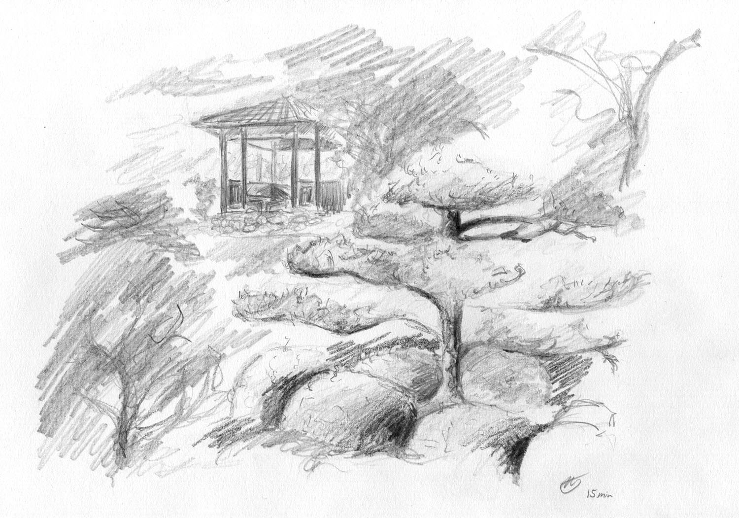
One example is this pretty landscape, with a house and some greenery. It's definitely a sketch, rather than photorealism (this particular one took an experienced artist exactly 15 minutes, just as reference), and yet the subject is very obvious. You can clearly make out the house, the stairs and the trees and grass around.


If you look closely, you'll notice that instead of drawing every stone of the house the artist has only hinted at its material with a couple of lines at the front-facing corner.
The trees and grass are mainly shaded areas of varying darkness, but still, the subject is as clear as day.
Another example is this cow's head from Suffolk artist Jason Gathorne-Hardy (I am a huge fan). Actually, it's really only three quarters of a head, he didn't even need to draw the entire thing.
It consists of a jumbled mess of squiggly lines and some shading, that's it. All of which is entirely enough to let me, the viewer, know it's a cow and nothing else. It's definitely less intricate than the drawing of the house, but no less effective.
Simplified Cow drawing by Jason Gathorne Hardy.
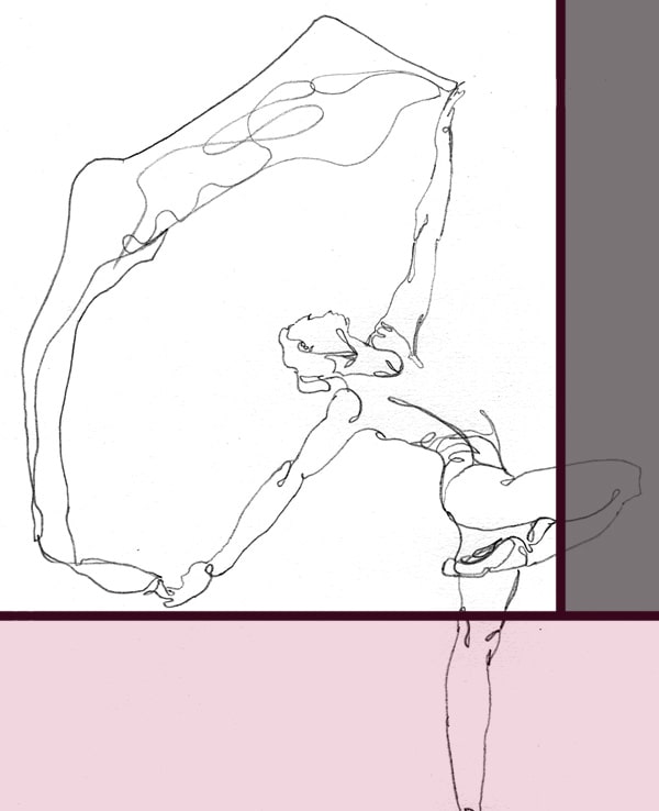
And, to take this one step further, we have the below sketch, sold on Etsy, that's really almost as simple as it gets, but still manages to spell the subject out with perfect clarity. It's a single line, with a few loops.
And yet, that seems to be entirely enough to convey the message, because the viewers brain and experience will "fill in the blanks". Absolutely fascinating, if you think about it.
Simplification exercises
If you were to draw a rabbit without simplification, how long do you think it would take you? Days, I recon, there's a lot of fur in a lot of different shades. So, how could you speed up the process?
For some things it can be surprisingly difficult to figure out how much you can simplify without sacrificing recognition. You might need a couple of tries, leaving more and more out as you go.
What is the simplest way to portray a pencil sharpener? How about feelings, like ‘joy’ or ‘anger’? Let’s try a few to get to grips with the concept, shall we?
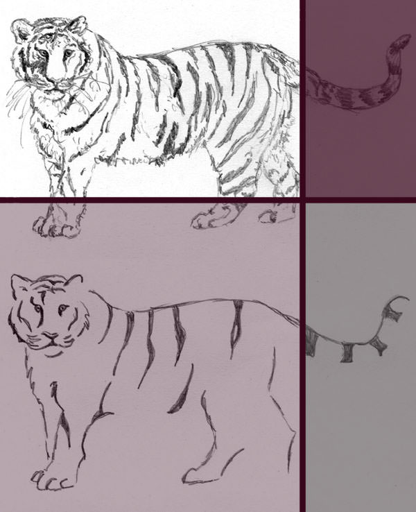
Exercise 1: Animals
Pick an animal you'd like to work with today. Mammal, bird, reptile, it doesn't matter which. Find a photograph of it (or a live model) and create a basic sketch. It should display the entire shape of your animal, in as much detail as you like, but leave out any shading.
When you're done, turn over the photograph (or turn away from the live model), so you only work from your first sketch for the next part. Draw your animal again, but this time leave out some more detail. Also try emitting parts of the overall shape, as it was done with the cow’s head above.
Once finished, turn your first sketch over and repeat the exercise with your second sketch as reference. Continue this way until you've reached the most basic kind of shape that still distinctively expresses your animal.


You'll likely find that you’ll quite easily get away with leaving out a quarter, perhaps even half of the general shape without taking away too much recognition value.
Surface structure is another thing that you might have added in the beginning but could reduce. If your fish had a body full of scales, or your goose had its wings full of feathers, in your last sketch you were probably only hinting at them, or left them out altogether.
In the end you should have at least three or four drawings of varying simplicity. Which of them do you prefer? The detailed, initial sketch, one of the simplified intermediates or the very minimalist final version?
Knowing your own tastes in this is a valuable resource on your way to discover your own, personal style of art, if you're still searching.
Exercise 2: Objects
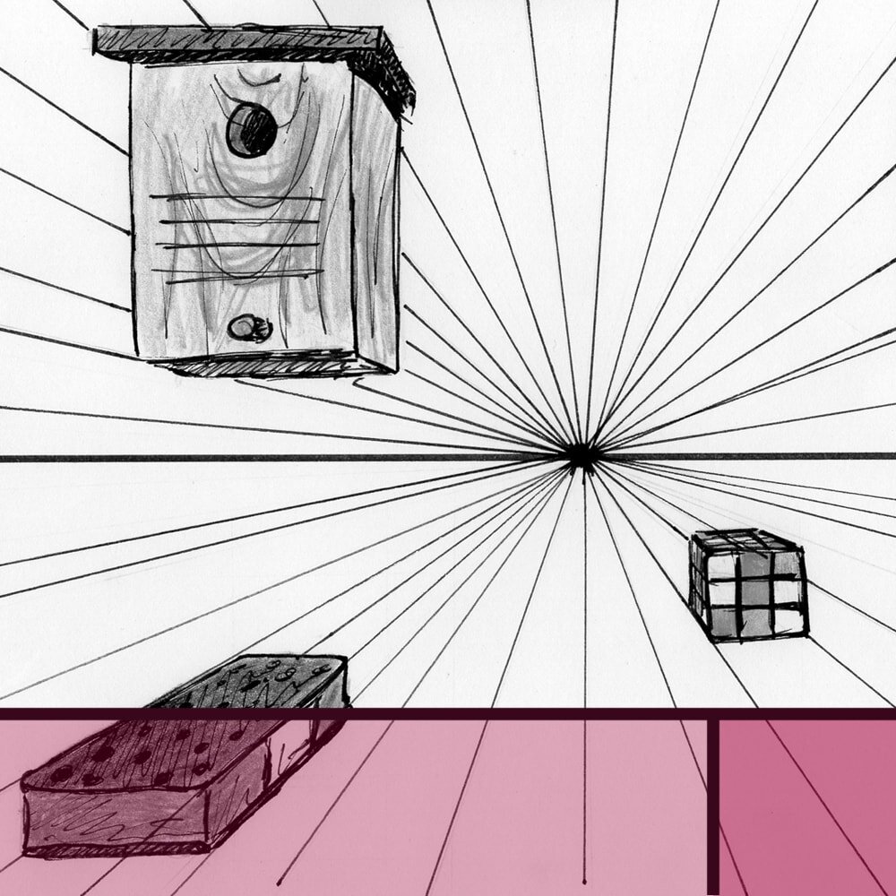
Another option to practice simplification is to limit yourself to straight lines only and count their number. Pick an object from your household, such as a watering can, your fountain pen or the hoover in the kitchen.
Draw it, with straight lines only. Then repeat this, leaving out more and more lines as you go, until you've arrived at the minimum number that makes it still identifiable (ask a friend if you're not sure after looking at it for so long).
Number of straight lines used for each of the simplified sketches is indicated on the side.
Depending on your object you might get away with under ten lines. If you still need a lot, consider the reason.
Was it a complicated shape? Or is your object simply not an everyday item that's easily recognised? Did you manage to half the number from your first to the last drawing?
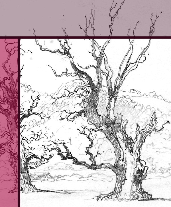
Exercise 3: Landscapes
For our third exercise, we're going to up our game a little and tackle a landscape. Choose a subject for today, that contains some different forms of greenery.
Now attempt to draw it in 15 minutes. Put as much detail in as you are able to within that time frame. Once finished, take a good look at your work. Try to find areas that you think you could simplify, without taking away too much information from the viewer.
Knowing what part of the subject you want to be your focal point is critical for this, as that is the are you’ll want to spend most time with going forward.


Repeat the exercise, but limit yourself to half the time. Compare the two results, what did you leave out? If your landscape contained trees, you'll likely find it's going to be branches, leaves or surface structure, such as bark.
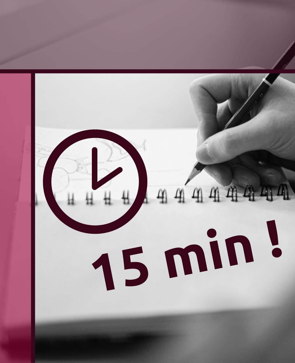
Study your second version for more possible simplifications and then draw it one more time, taking no more than 60 seconds.
If you got a bit too stressed and don't like your final result, or you think it is not recognisable anymore, you can repeat the last step as often as you like, until you're happy with your outcome.
Exercise 4: You
Now let’s have some real fun and use ourselves as the subject. You're going to need a mirror of some sort, obviously.
Have a good look at your face and try to find any distinctive features that you have. That could be your signature hairstyle, freckles or the shape of your nose.
If you can't think of anything you can include your clothes, or any jewellery you wear often. Anything that makes you ‘you’.
Now sketch yourself. Take as much time as you like, but use thin lines. When you're done, use your eraser and remove bit by bit of detail, as much as you can while keeping yourself recognisable to your friends and family.
Self-Portrait (1945) by Henri Matisse.
This exercise is highly valuable in making you consider your target audience when simplifying. As with the Onigiri example above, different viewers will need varying levels of detail to recognise a subject.
In this case, your friends and family will obviously need much less information to fill in the blanks as someone who’s never seen you before.
Have a look at my other drawing exercises for more practice.


Did you enjoy this article or feel like you have anything else to add? Feel free to leave me a comment below!
If you like this post, please share it, so others may like it too!

