Architecture-themed Art Prints that will Impress and Inspire you
In order to draw architecture well the artist needs a solid foundation and good understanding of perspective. And as we all know that's one of the hardest things to learn in the arts.
In this series of posts we're celebrating and supporting some of the most talented artists on Etsy, the website for selling handmade things made with skill and love, not in a factory.
As part of the architecture topic, I was looking at some of Etsy's finest prints and products inspired by architecture.
Note that I am not an Etsy affiliate, so all recommendations are entirely my own and I receive no cut from the sale of any of these items.
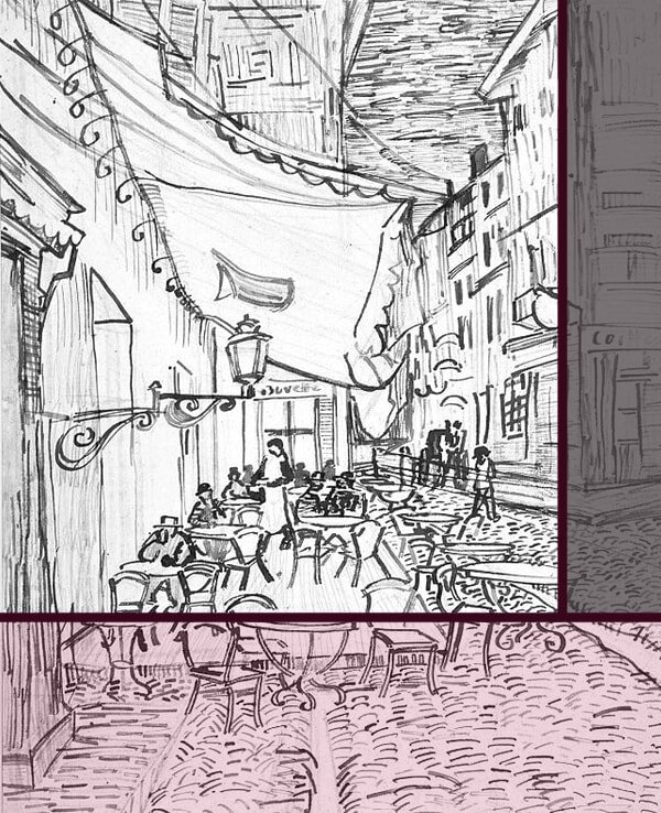
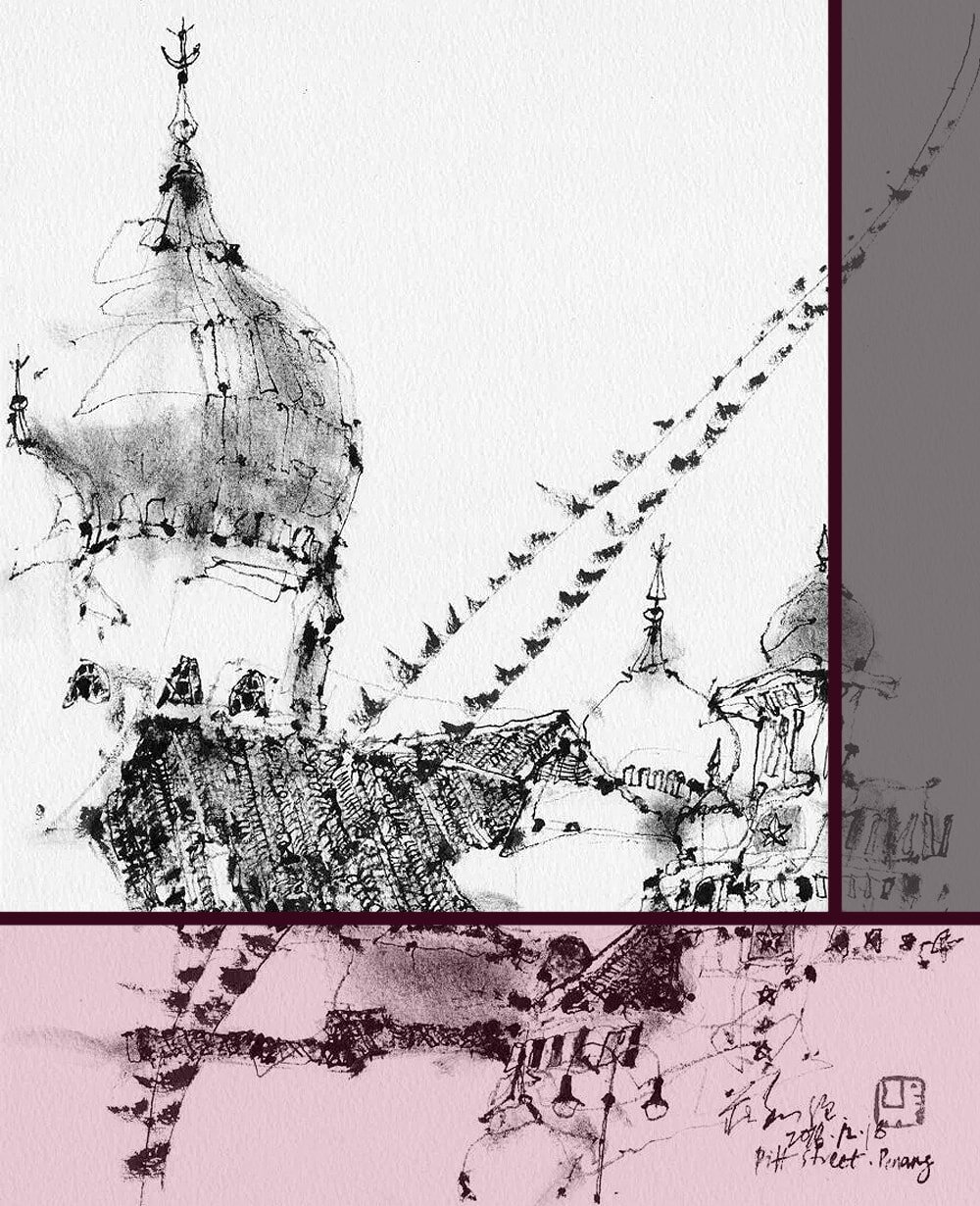
Edinburgh Old Town Art Print
Edinburgh Old Town Art Print by diedododa via Etsy.
Alright, alright, I admit it. I'm biased. Of all the cities I’ve ever been to (and lived in) I love Edinburgh the best. It’s the most beautiful, artsy and inspiring place one can imagine.
So it’s not a surprise that artist Dodo has picked one of its pretty, historical streets as a subject for this charming drawing. The curve of the road and the combination of white and bright colour make it incredibly intriguing and pleasing to the eye.
Yet those special features are also what would have made this subject quite tricky to draw, with curved vanishing lines (see my post on One-Point Perspective for more info) and all, so hats off!
What can we learn from it?
If you follow the curve with your eye, you’ll notice how the artist uses less and less detail and more ‘suggestions’, e.g. seen in the windows on the right. That technique is difficult for beginners, who often get carried away and add too much detail everywhere, so it’s well worth practising this skill.
India Art Print
India Art Print by PinkplumIllustration via Etsy.
This super adorable print from Carol from PinkplumIllustration sits somewhere in the middle between drawing and painting.
She manages to show the mix of tradition and modern vibrancy of the place with the use of both, earthy and bright colours. And she creates the liveliness of the place by using those uneven, slightly squiggly lines that make the buildings look almost as if they're moving.
What can we learn from it?
We do not always have to stay realistic with straight lines and accurate colouring. Being a little bit messy in all the right places can lead to real gems, like this one.
Rome Playing Cards
Rome Playing Cards by aarontrotter via Etsy.
I am just such a sucker for "rough" sketches that are clearly done on location, now the same as 500 years ago. Tradition, you know.
And this incredible deck of playing cards by Aaron from aarontrotter gives me just that. I can practically see him sitting there with his pens and his little sketchbook, getting worked up over the beauty of Rome where practically everywhere you look there's a sketch-worthy view.
I haven't seen all cards in the deck but I'm already in love with just the front cover. That little stretch of ancient cobblestone road gets more interesting the longer I look at it.
What can we learn from it?
It's absolutely remarkable how much interest you can create just by mixing things up and using a lot of different sizes, shapes and textures. Hardly any shading and just one colour and yet the eye is wildly entertained.
Tokyo Skyline Greetings Card
Tokyo Skyline Greetings Card by helenacarrington via Etsy.
This beautiful postcard by Helena Carrington showing the Sensoji temple in Tokyo really awakes the Wanderlust in me. The longer I look at it the more I want to pack a suitcase and head off to look at the sights myself.
Her style does remind me a little of Hokusai, combining areas of simple forms and colouring with other parts of the most complex detail.
But what really drew me in was the fact that she made her own decisions and didn’t let reality dictate what she could and could not do. Helena draws Mount Fuji where it isn’t actually visible (not quite like that, anyway), and she has no issue leaving out the entire road for a more stylistic effect. I’m here for it.
What can we learn from it?
You don’t actually have to draw exactly what you see. In fact, in the arts expression always trumps accuracy, and it’s your prerogative as an artist to decide what to leave out and what to add.
Cambridge Illustration Print
Cambridge Illustration Print by MushroomNookStudio via Etsy.
I mean, have you ever been to Cambridge? That place is an artist’s paradise, let me tell you. Alice Cao from MushroomNookStudio certainly agrees with me, because her amazing art prints clearly show that she can't get enough of the place either.
She draws with ink into a sketchbook on location, which is always worth mentioning, so there’s no photographing and light box tracing involved. Only raw talent here, my friends.
What can we learn from it?
Drawing on location really does lead to the best sketches. The 3D view, the noises and smells make the difference, I'm sure. Wakes up the brain. Also, look at how super complex the work looks when the essentials are remarkably simple, one colour, one medium and a lot of practice.
New York West Village Restaurant Art Print
New York West Village Restaurant Art Print by downtowncollective via Etsy.
This delightful art print from artist Kelli from the downtowncollective is yet another perfect example of how a simple drawing style does not equal boring. Because this restaurant illustration is clearly anything but.
She’s made all the right decisions on where to go into detail (the plants) and where to give just hints (the bricks). And all the white space combined with those faint and muted colours, makes this balance particularly successful.
What can we learn from it?
Drawing every single brick of these walls would have been a mistake. Often all that is needed are a few cues, here and there. Less sometimes really is more.
Canyon City
Canyon City by TimStokesArt via Etsy.
Australian artist Tim Stokes clearly makes his own rules. Less is more? Nah. More can be better sometimes.
I am just so fascinated by his drawings, especially this particular one. He shows a very advanced grasp on perspective which must have taken years to master. And as you can see he can now very realistically draw something that is entirely unrealistic.
Not only is his one-point and two-point perspective on point (get it?), he didn’t forget aerial perspective either, so you can see the buildings becoming less defined and lighter the further back they are. What a good work, consider me officially impressed. And a little jealous.
What can we learn from it?
This is a perfect example how far a good observation and knowledge of perspective can get you. If you want to draw from imagination, start with the basics, then work your way towards the artistry displayed above.
Liverpool Albert Dock Greeting Card
Liverpool Albert Dock Greeting Card by GraceEmilyArt via Etsy.
Working my way through Grace Cummings portfolio on Etsy I’ve become quite the fan. Her work is just so vivid and joyful.
There’s lots to see in this cute drawing of Liverpool, with the pretty, old-school streetlamps and historical buildings in the background.
Most importantly the few splashes of colour totally transform the drawing and give it ever so much character. It turns a serious, straightforward architectural scene into a fun extravaganza that works nicely with the spirit of the city itself.
What can we learn from it?
One should never stop experimenting and having fun with their art. Especially with “serious” subjects that don’t express much emotion themselves, such as architecture or some still lifes. Also: if in doubt add some colour.
Chester Cathedral Cards
Chester Cathedral Cards by LawandDraw via Etsy.
I feel like it’s time for some early Christmas card shopping, considering how pretty these ones are. Though they can just as well be used for lots of other occasions I think.
Manchester artist Bethany shows off her talent by creating this extremely intricate drawing of the Cathedral in Chester. It must have taken her days with all the stonework and tiniest detail.
The interesting combination of intricate detail versus rough plant sketches framing the historical building makes up a lot of this card's charm and I love it.
What can we learn from it?
Sometimes sketching just isn't enough and we should spend some time on an elaborate drawing. Get the angles just right, add all the detail we like. Then combine it with some rougher, almost unfinished work in other parts that makes it perfect because it isn't. Makes sense?
Special mention: Wooden City Map
Wooden City Map by 1Man1Garage via Etsy.
I know, neither a drawing nor a painting, but my goodness is this thing cool though. I obviously don't expect anyone to learn how to create a wooden masterpiece like this if they're here for brushes and pencils, but with a bit of imagination we can surely all find some other inspiration to take from it.
If artist Marcus Williams can make something like this out of a piece of birch, what could we do with a blank piece of canvas!
What can we learn from it?
Don't get stuck on what you think something means. Just like a Still Life isn't always bowls of fruit, architecture art doesn’t have to be a frontal view of a street. It can be an entire city block or village from above. Or a building as an ant would see it, for that matter.
For some great tips and tricks have a read through my other architecture-related articles.


Did you enjoy this article or feel like you have anything else to add? Feel free to leave me a comment below!
If you like this post, please share it, so others may like it too!