How Still Life can improve your Drawing Skills
I’m not going to lie, I used to roll my eyes at the idea of drawing a still life. It’s all just fruit bowls and wine, isn’t it? Then I spent some time with the topic and discovered that, in fact, still life art is so much more interesting than that!
Non-moving objects, often with relatively simple shapes, are the perfect way to learn (or remind oneself of) a few important foundations.
I’m talking about things like shading, reflections, composition, how to even start a drawing. All the basics that we’ll need for any picture, be it a still life, a landscape or a portrait.
What is a still life?
Still lifes (yes that’s the plural form, I know it looks odd) have been around since the ancient Greeks, but it was the Dutch around the 16th century that made it an art genre by itself and perfected it over time.
With a few exceptions the definition is actually quite simple. Any non-living or inanimate (still) object, either natural or man-made, can be arranged in a still life.
As such, a still life can be just so much more than the obligatory bowl of apples and pears. Yes, it can be fruit, or any kind of food, really. And it can be bottles and vases. But it also includes clothing, rocks, books, dolls, furniture, your fireplace or your favourite pair of earrings.
‘Flowers’ by Antònia Ferreras Betran, ca. 1935
Trompe l'oeil by Cornelis Norbertus Gysbrechts
But of course there are no rules without a few exceptions. Architecture, whilst not alive, doesn’t really count as an object. Plus, you’re meant to be able to manually arrange the objects in the still life, at least theoretically. Your living room couch, however, does count.
With plants things can be even more confusing. Cut flowers are universally accepted, as you can see in my article on How to draw beautiful Roses for a Still Life. But the opinions differ when it comes to houseplants or that little berry bush in your garden.
These plants are very much alive and not technically inanimate (they grow and move with the sun), nor are they objects. And yet plants in a pot are quite regularly the centre point of still life art.
Still lifes are defined as showing inanimate objects. Yet not all parts of a still life are inanimate, nor objects.
There can actually be humans and living animals in a still life, just so long as the non-living parts make up the majority and are the focal point. Otherwise any picture of a group of people having dinner, for example, would be considered a still life.
But a drawing or painting may have still life elements, without being a still life in itself. Look at the below painting of Diana returning from the hunt by Peter Paul Rubens. The elaborate fruit arrangements and dead game are certainly still life elements, but the painting itself isn’t one.
‘Diana returning from the hunt’ by Peter Paul Rubens, ca. 1615
As you see the genre can be tricky to define completely, and while there are guidelines, any clear definition automatically comes with exceptions. Just use your own best judgement or simply don’t care whether or not you bend the rules a little or break them altogether.
Why is creating still lifes good practice?
The absolute best thing about drawing still lifes is that you can begin with relatively simple shapes, like vases, bowls and bottles. Contrary to the human form, animals or landscapes, which always have a certain difficulty, a still life can be as easy or as complex as you want it to be.
Because of that you can concentrate on getting to grips with some of the most important drawing foundations without being overwhelmed or distracted by details.
Still life drawing of a jar. Artist unknown
If you wish to learn how to shade, it's a lot easier to start out with a couple of apples, as you can easily work out where the light is coming from and how this affects the rounded, simple surface of the fruit.
And even better, if your still life is indoors you can change the lighting any way you like. The light won’t change with the time of day and you can use a portable lamp to try out different angles and see how that affects the shadows on your subject.
Controlled light in an indoor still life removes some difficulties for beginners, such as daylight changing in intensity or angle while you’re working.
I'll admit apples are not the most fascinating subject for an artist to work with, but they'll help you learn how to spot your tones, from the brightest highlight to the darkest shadow, and especially the more difficult ones in between.
And once you've mastered your hatching and cross-hatching and smudging techniques you can move on to greener pastures and more complex subjects.
For a bit of practice straight away just pop by my article 6 fun Still Life Exercises to boost your Drawing Skills.
Metal cup against orange background by Christopher Willard
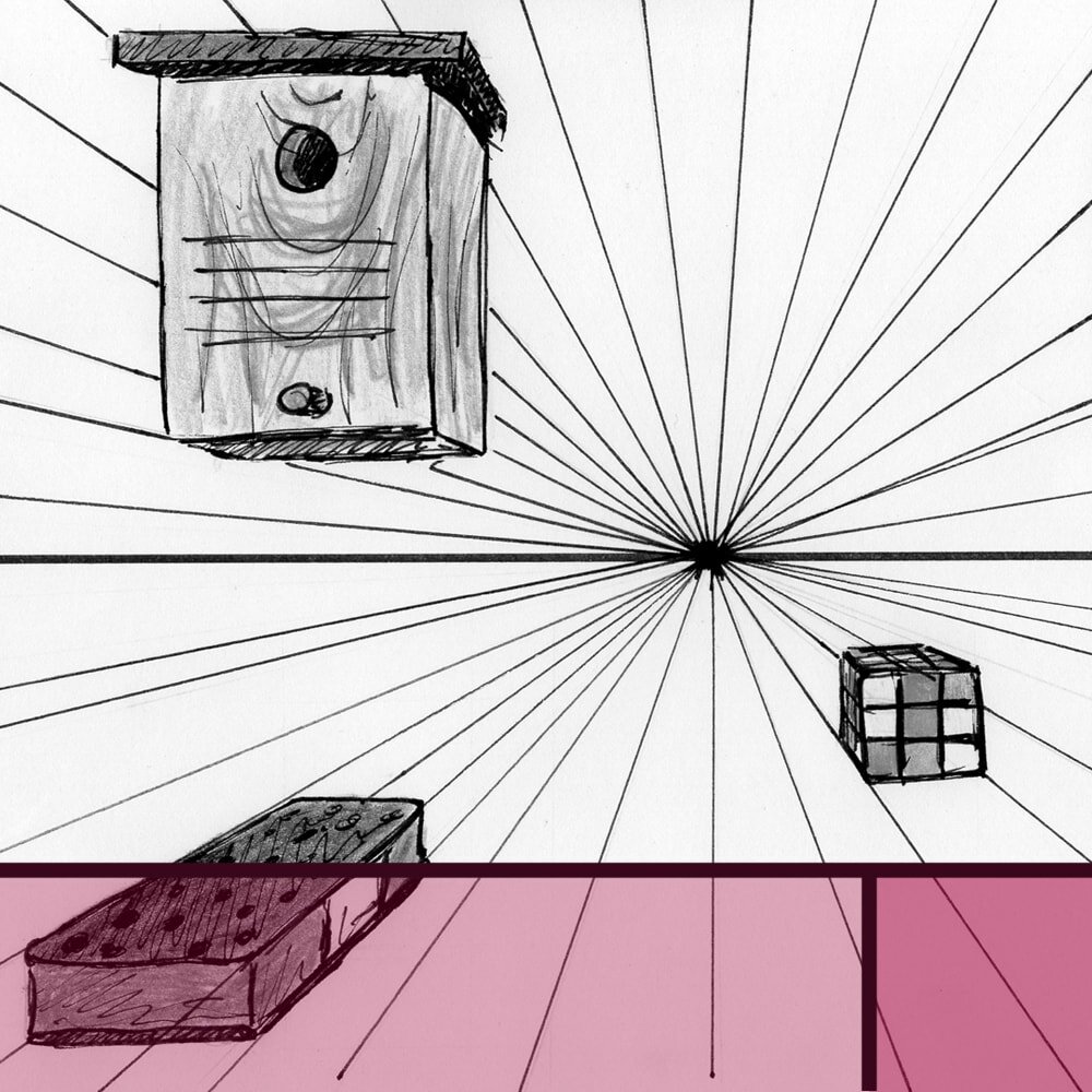
Another advantage of starting with simple shapes is that it's the least confusing way to introduce you to maybe the most complicated drawing topic of all: perspective.
Trust me on this, if you want to understand perspective from different eye levels, vanishing points and even foreshortening (that's my personal Everest), working with boxes and vases is a fabulous option because you can arrange them whichever way you want.
Still life with cabbage by V. Karakashev (1965)
Another very hard thing to get right (especially without a reference) are reflections, such as on glass, or metallic surfaces.
The effect of light falling onto a curved surface and reflecting a distorted image of nearby objects is complicated. There's no denying that. Even just spotting reflections correctly can be wildly difficult in a complex array of objects.
Seeing and interpreting reflections correctly is a difficult task, and much easier to learn with a limited number of simple objects.
But starting off with your obligatory ‘wine bottle next to a candle’ can make it a lot easier for you. As with everything you're learning new, try to understand the principle first, then move on to the advanced stuff.
That's why children first read about dogs playing ball and not about Hamlet's strained relationship with his uncle and budding musician starts with ‘Twinkle Twinkle Little Star’, not with Sarasate's ‘Zigeunerweisen’.
Canto 6 by Rob Møhlmann
Another advantage you have with still lifes is that they can they can teach you about composition, like nothing else can.
Often you'll find something in famous still life drawings and paintings that looks accidental, like the artist was somehow lucky enough to come across an arrangement that is particularly stirring or pleasing to the eye.
But of course we know that what looks accidental has probably been intentionally arranged that way. The artists of old, just as the artists of today, put a lot more thought into their compositions as is obvious at first glance.
A good still life needs a bit of consideration. Luckily with this form of art you can usually arrange the elements yourself and be very intentional about your composition. Where a landscape or animal drawing is usually captured ‘as is’, the still life can be designed and moved around in any way you like.
Unlike in a landscape or a portrait you can arrange the objects in a still life any way you like and be very intentional about your composition.
That includes taking some time to consider what you want the message to be and your viewer to feel. You can let colours work together, use a combination of textures to add interest, play around with shadow and reflections.
Would you like your objects to work as a group or would you rather a single one stood out? Do you want your composition to be calming or stirring, joyful or melancholic? You can add symbolism, too, where a certain object can represent an idea, opinion or a feeling (like the skull reminding us of death).
Canto 66 by Rob Møhlmann
Working with various objects also automatically requires you to learn how to draw different kinds of materials and textures. Objects might be made of glass, wood, plastic, metal, fur and so on. Some can be matte, others slightly shiny or highly reflective. They can be smooth, soft, fuzzy or prickly.
All of these different properties need different shading, linework and provide a different kind of challenge.
Which is great for you, because with an immobile still life you can take your time to work out the best techniques. Then you're ready when the same material shows up in a more time-sensitive setting, such as when you're taking your sketchbook out on the go.
Consider why the object is made of that material. This will help you understand what you draw and will provide invaluable knowledge if you aim to draw without a reference one day.
Try to think about the relation between material and function or the other way around. Did the creator choose the material for a specific purpose, or did the use of the object affect its material, for example causing wear?
Vanitas by René Grönland
Drawing objects that you can touch, turn and place yourself is also immensely beneficial for your understanding of the objects themselves.
As I've mentioned in my post 5 simple Drawing Exercises for Beginners, the human brain has a tendency to create certain kinds of templates for things and it's hard to make it realise there's more to it than just that one specific view.
If you think of a bottle, what do you see in your mind's eye? I bet it's a very specific kind of bottle, from the usual side view, so you see the entire height of it.
But there are many kinds of bottles out there, and they appear different from high angles, low angles, from the bottom or the top. Just as there are many kinds of apples, rocks, shoes.
Drawing different kinds of objects all representing the same idea (such as ‘bottle’) will re-calibrate your brain and remind it to actually look, rather than assume something that isn't there, just because that's what it usually looks like.
And working with an object from many different angles will not only extend your visual library but it will also help you create very interesting compositions that don't always have the ‘conventional’ perspective.
Famous still life art that is not boring at all
I never used to be a fan of still life art. Until I realised the wide array of objects, angles and arrangements offer you possibilities of expression that other art just doesn’t. Now I am entirely fascinated by it.
Everyone defines ‘interesting’ in a different way, for sure. But sometimes it helps to pause before discarding a work of art as ‘dull’. Let your eye wander for just a moment longer and you might find yourself captivated by a skilful composition with many wondrous details.
If nothing else, it'll help you to follow the artist's journey and make you appreciate their intention and execution. Ask yourself, why did they choose this particular lighting? Why this specific arrangement of objects? What is their focal point? What might the message be?
Still Life With Burning Candle by Pieter Claesz, 1627
Not every piece of art speaks loudly and clearly, nor does it need to. Sometimes it's the slow burners that manage to captivate us the longest. This dimly lit painting by Pieter Claesz is an understatement deserving of our attention.
The artist uses subtle colours with a limited palette, so as not to distract from the composition itself. You can see various kinds of materials, such as brass, iron, wood and glass, all painted to absolute perfection.
My favourite parts are the reflection of the candle in the already super interesting glass of wine and the amazing play of shadows on the book in the front. But the longer I look at the piece the more skilfully painted details I discover.
Still Life with dried flowers, Vincent van Gogh
Other times, yeah, a painting can be screaming for attention and who are we to deny it that? Like practically every van Gogh ever discovered this still life with dried flowers is a real eye-catcher. And even after closer inspection it does not disappoint.
There are just so many different textures in this very limited subject matter, and their interaction makes for spectacular entertainment.
Van Gogh is using some complementary colours here (yellows and blues), which, together with the most amazing brush work, makes the piece even more vibrant.
This work is practically bursting with inspiration and wonder and instilling it in everyone who looks at it. I wish for every artist to enjoy working with their subject as much as van Gogh clearly enjoyed painting this one.
Accessories for the Hair, Katsushika Hokusai
Ah, Katsushika Hokusai and his humble mastery. In case you’re wondering, yes, that’s the same Japanese artist that gave us the thirty-six views of Mount Fuji, including The Great Wave.
This woodblock print depicting accessories for a Japanese woman’s hair uses very faint, limited colours and works its subtle magic by adding an amazing display of texture.
While the hairpiece at the top definitely draws the attention at first, soon the eye wanders to the artfully arranged wrapping paper with its many folds and partial transparency.
Sadly, my Japanese isn’t quite sufficient to translate the writing on the print, so we’re just going to have to let the subject speak for itself. Which it does, quietly but beautifully.
Le Jour, Georges Braque, 1929
French artist Georges Braque has created this Cubism still life of daily objects (“le jour” translates into “the day”), including fruit, a knife (to presumably cut the fruit), a string instrument, a pipe and a jug.
Personally, I find the actual star of the show is the console table with its amazingly intricate wood pattern. Look at how simple the idea is, it’s really just a lot of marks on a relatively monotonous background colour, and yet it’s so effective and interesting.
Civil War, Darius Cobb
I absolutely adore this Trompe l'oeil (3-dimensional painting) by American artist Darius Cobb.
The wear and tear on the leather bag and especially the dented and battered surface of the flask are painted to absolute perfection, I can almost feel the material.
But most importantly, think about the hidden implications, what the image doesn’t say out loud. Those objects belong to someone, and that someone has a story of his own. All of these things are clearly used, a lot, so they speak of an owner who has seen war, for quite some time.
They make you imagine what that soldier might have been through, what hardships he might have faced, what bravery shown.
And that’s a fabulous reminder that a still life ought to be more than the summary of its parts and objects. Their role is to tell a story and lead the viewer towards the message of the piece, whatever the artist deems that should be.
For more tips and tricks have a read through my other still life-related articles.
Did you enjoy this article or feel like you have anything else to add? Feel free to leave me a comment below!
If you like this post, please share it, so others may like it too!

